Thursday, May 16, 2013
Project 3: Synposis
After looking at all of the bike trail information, I found myself extremely overwhelmed with having to look in several different places to find maps and overall trail information. That being said, I wanted to organize all of this content into one place in a way that was simplistic and easy to use. The easiest solution was through an app, which was primarily why I changed my original idea. I felt that the app could better fill the holes that were missing in terms of how the bike trail information was being organized–it was all over the place! I felt that my original idea would have only created more confusion and was something people would have just thrown away after one use. It also had a shelf life in that it was a calendar for the month of May.
I think my app is very simplistic in terms of how the content is arranged, but I think design is very dynamic and different. I think it definitely stands out in terms of app design–it’s very different! I enjoy the overall feel and color choices, which I think what really separates it from most app design. I wanted it to be progressive, because I feel as though that is how I look at biking. It’s naturally a forward moving activity (in the literal sense) and I also see biking as something that is rather on-trend right now in terms of sustainability, which is progressive. So while biking is considered and old means of transportation, I see it as a regression as a means to progression. I have also been told by people that it looks “very bike-y,” whatever that means, but I’ll take it.
Wednesday, May 15, 2013
Project 3: Completion
Despite my risky move to change my idea at the last minute, I think the results were good. I definitely came a long way! I'm just so happy I decided to go this route rather than making something so disposable. I think my app will be very useful to those in the area looking for places to ride their bikes, especially with the locate me function. I also like the overall feel of my app and I enjoy that it's different from any other app I've seen before. I was definitely looking to create something fresh and new and I feel the colors helped with that especially. I think my audience will also enjoy the colors and overall feel, which seems very industrial to me, especially with the working bike gears. All in all, I enjoyed creating a bike app with a very distinct feel.
It was quite the process trying to figure out how I was going to organize all of the information I wanted to include in my app. I knew I wanted a GPS locator so that area riders could look up the trails closest to them, but I also wanted to create a comprehensive app. That being said, I had to come up with a clear way of accessing all the information I wanted to include. This was another reason why I made the switch from the mailer to the app–I felt that it allowed for me to compile so much more information in a way that was useable.
For this project, I decided to create a booklet, outlining the interface's various stages and capabilities. I felt that this would be the best way to present my app's design.
Below is an Issuu document of my booklet created for this project.
Thursday, May 9, 2013
Project 3: App Design Iterations for Critique
Now that I have my app's architecture mapped out and I have an idea of how it would work, I needed to create the interface's various stages. I also needed to develop a system for my trail maps. Trying to figure this out is hard and I'm hoping after Thursday's critique, I will have a better idea if my current system is effective for reading/using.
So far, here are the various screens in their phases...
Note: I have done some of these various stages for an Android phone as well, but as to not repeat myself, I am choosing only to show it on the iPhone in its entirety.
Start-up page...


Home page...


So far, here are the various screens in their phases...
Note: I have done some of these various stages for an Android phone as well, but as to not repeat myself, I am choosing only to show it on the iPhone in its entirety.
Start-up page...

Loading page...


After clicking "locate me," you will be directed to a loading page
And then finally, you will be directed to this page, which allows you to click on a mint circle to find the closest trails.

After clicking on "see nearest trails," you will be directed to a page listing all the nearby trails. From this page, you can click on any of the trails to see more information and a link to a map of that particular trail.

Here is a sample page of what the trail information page would look like.


And here is where you would be taken upon viewing the map...

Upon clicking, "Regional Trail Info" on the bottom navigation of the app, you will be taken to a page that lists ALL of the trails. From here you can click on any trail and be taken to its information page to view more about the trail.

Another example of a trail information page and map...

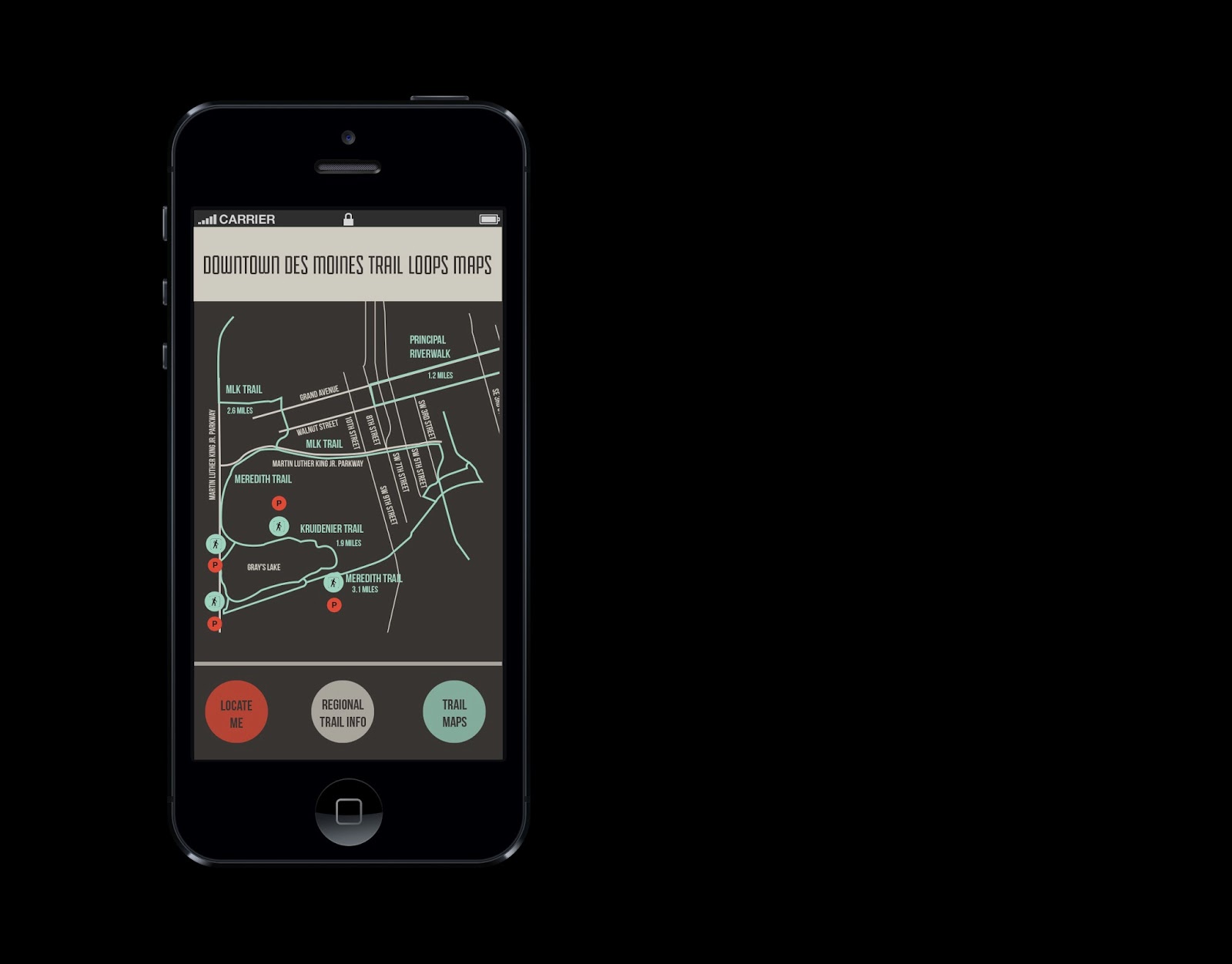
Upon clicking, "Trail Maps" on the bottom navigation of the app, you will be taken to a page that lists ALL of the trails which links you to each of the maps.


Things I should consider:
- I'm definitely considering exploring an option of zooming in on the map to see more entry points or perhaps what's nearby. Though, I'm not sure if that would be really useful for all of them considering some of them only have a few entry points.
- I also need to change my alignment/sizing of some of the graphics. I've noticed that they are not quite "there" yet.
- I need to keep some of elements consistent in terms of size and placement.
Wednesday, May 8, 2013
Project 3: Updated Project Brief
Objective
Create a comprehensive app and includes essential information for Des Moines area bike riders and those new or visiting the Des Moines area. This app will include a GPS navigator to locate nearest trails, information about distance and types of trails, and trail maps. Through this project I will develop an easy way for area riders to access information about bike trails by putting it all in one place in a very simplistic manner.
The overall design and concept will be fresh, progressive and new. While biking has been historically a primary means of transportation, I feel that now more so than ever before, it is seen as something rather progressive and on-trend so-to-speak. Tapping into this, I want to create something progressive and different in terms of app design.
Client
The client for this project will be the Des Moines Bike Collective.
Audience
The audience will be Des Moines area bikers, both new and old.
Requirements
There are no requirements other than the ones I have established for myself, which is to create a comprehensive app.
Tuesday, May 7, 2013
Project 3: Major Changes
I decided to take a risk and completely change my idea for project 3. My original idea was to create a mailer that would include both a calendar for bike month and a map of Des Moines area bike trails. However, I began thinking about the shelf life of a mailer and decided I wanted to create something that lasted and was perhaps a bit more useful. The world has enough stuff and I thought it would be something people would use once and throw away. Lately I've been thinking about trying to create things in terms of systems, rather than things so that was why I made the executive decision to change my idea to something a bit more sustainable.
In terms of my information design, not much really changed. I am still going to design area bike trail maps and include them in a comprehensive app that includes trail information, as well as a GPS option which would locate nearest trails, detailing their information and map.
Below are my color choices, typeface choices and logo I developed for this app.

And here is my app architecture...

Wednesday, May 1, 2013
Project 4: Overview
All in all, I think our group worked really well together to develop a concept that furthered the idea that the law students were trying to convey. Ultimately, we were trying to develop of a sort of narrative that told a story of blight, abandoned areas transforming into environmentally friendly spaces and redevelopment. Thinking about this message that the law students were trying to convey through their report and presentation, we aimed to come up with something that could tell this very positive “story.” We collectively developed a gradient color scheme, ranging from grey to green to help communicate the narrative of the transformation of blight areas to revitalized development. Our initial layout included a triangle to represent the basic building block for development and creation. This triangle was on the upper right-hand side of the page and would change from section to section, ranging from grey to green.
We were all very flexible, especially after our initial critique with the law students, forcing us to reconsider a new motif to replace the triangle, which they did not like. Ultimately, we came together to develop a new motif and a new way of displaying said motif. Thinking about the original purpose of the triangle, which was to help show a progression in color from grey to bright, happy greens, we aimed to accomplish something similar. However, we approached it such a way that was perhaps more obvious to our audience, who probably would not notice the subtlety of the triangle and that it was changing colors from section to section. We also had to consider the fact that the report would be printed in black and white, so we needed something that was a bit more obvious in terms of progression. We also chose a rectangle instead of a triangle to be our motif since it looked perhaps most more recognizably as a building.
Project 4: Done
Project 4 is finally done! I think we did a decent job at honoring the law students' wishes while also creating something visually appealing and interesting. Our color choice change was a good move, but I was glad that they still liked the idea of creating a narrative through the use of color. While I liked the triangle and had to sacrifice it, the rectangles have started to grow on me. They definitely represent the idea of redevelopment and rebuilding, I think even more so than the triangle.
Here are some snapshots from the final report layout!


Here are some snapshots from the final report layout!


And here are some snapshots from our presentation....


Project 4: Final Brief
Objective
Develop a clear, well-designed report publication and presentation for our law team to present and distribute to city council. Our law team’s report is called Urban Infill and Sustainable Redevelopment in the Des Moines area. Our law team is working to get the local government to redevelop areas of urban blight in Des Moines. These areas are seen as both environmentally hazardous and generally damaging to the appearance of the land. The group will also promote the incentives of making these redeveloped areas environmentally friendly by following LEED certification guidelines.
Client
Our clients are two law students, looking to communicate the importance of revitalizing abandoned lots and turning them into something that would help revitalize the area while also being sustainable. Our law team wanted to make sure we approached these assets in a way that expressed a movement from dreary blight to renewal and growth through development. Thinking about their mission, we collectively decided upon the idea of a gradient color scheme that progressed from a dark grey (signifying urban blight) to a bright green (signifying the renewal and growth of redevelopment). This also adds a sort of narrative to the presentation. Each "step" of their report is assigned a different color, as shown in our motif of rectangles used under report headlines.
Audience
Our client’s report and presentation were to both be distributed and presented at City Council, thus we were dealing with a wide audience that was typically older. Keeping this in mind, we used a larger typeface than we normally would have, with equally larger leading, making it more legible for an older audience. We also wanted to keep the design simple and clear, with idea in mind that the audience would be more concerned with content of the report and less with the overall design. Not that design did not matter, but it was to work in harmony with the content--not outshine it.
Requirements:
1. A professional, clear report
2. An editable presentation
Timeline:
April 4th
Meet with the law students to determine colors, overall feel or message they are trying to communicate. Also, in the meeting, discuss the best ways to communicate throughout the entire design development process. After this intitial meeting, group members are to come up with various spread ideas for the report aspect of the project, keeping in mind the overall message that the law students are trying to convey.
April 9th
Meet with group to choose colors, layouts, and typefaces. Also figure out a way to delegate work throughout the group. Work towards creating a layout for our first critique.
April 11th
Continue to develop layouts, working collaboratively.
April 16th
Begin preparing for a critique with the law students. Complete several spreads and prepare the presentation to be shown to the law team.
April 18th
Critique. Make any necessary changes based on feedback from the law team. Begin considering new iterations.
April 23rd
Prepare work to be presented to the law team for a final critique before final text and imagery is placed in the report.
April 25th
Final critique. Make any necessary design changes. Law team will provide final copy on Friday. Over the weekend, place final copy in the report layout and send back to law students to edit. Make edits accordingly.
April 30th
Finish report layout with final copy. Send to law students and Professor Rosenbloom. Provide Professor Fender with an Indesign Markup File of the report layout and presentation.
Sunday, April 28, 2013
Project 4: Almost done....
Project 4 has been moving along relatively easily. Despite some changes that needed to be made, our group has done an excellent job of getting things done, dividing up the work, and making any necessary changes the law students need.
I took on designing section five for the final stretch of our assignment. My section was to have an info-graphic of sorts, so it was fun to find a way to incorporate that into my section. I used the progression of colors to mimic our headers and went from there.

I took on designing section five for the final stretch of our assignment. My section was to have an info-graphic of sorts, so it was fun to find a way to incorporate that into my section. I used the progression of colors to mimic our headers and went from there.

Tuesday, April 23, 2013
Project 4: Alterations and Ideas
After meeting with the law students, it was determined we had to change the triangle. The whole group was to come up with new ideas.
Here's what I came up with...


Here's what I came up with...


Sunday, April 14, 2013
In Progress: Project 3 & 4
Project 3 is coming along slowly but surely. Designing a map of Des Moines area bike routes and trails was much more complicated than I anticipated. That aspect is definitely still in the works. However, I have narrowed down typefaces and colors for the calendar aspect of my design.


Project 4 is moving along rather smoothly. After Rachel and I designed and developed master pages for both the document and the presentation, we divvied up work between other members in our group and began working, each taking a section. Here is what I have done so far for my section:


Project 4 is moving along rather smoothly. After Rachel and I designed and developed master pages for both the document and the presentation, we divvied up work between other members in our group and began working, each taking a section. Here is what I have done so far for my section:


Monday, April 8, 2013
Project 4: Initial Ideas
Our group of law students described a type of narrative that they wanted for the feel of their document and presentation. They wanted it be dull in the beginning and then progressively get more colorful as they offered solutions to the problem they were tackling
Because we currently do not have the actual document at our disposal to work with, my group and I have decided to choose colors, typefaces, and create potential mock-up pages for the document. At this point, this is our only way to explore different avenues in terms of layout.


Because we currently do not have the actual document at our disposal to work with, my group and I have decided to choose colors, typefaces, and create potential mock-up pages for the document. At this point, this is our only way to explore different avenues in terms of layout.

Colors and typeface

Layout

Layout
Wednesday, March 27, 2013
Project 3: Examples, Brief, etc.

For my project, I think I’m going to tackle a bike route map. When I saw it, I felt a little lost and immediately knew I wanted to change it. For me, the problem lies in the color choices–they’re too similar to the map itself! The bike route lines also don’t stand out from the rest of the map. I found myself constantly searching for clarity in it’s design. I also began to think about how bike riders might grow frustrated with it, especially as they were riding and trying to navigate. After noticing this, I decided I wanted to tackle the bike map route and relate it Iowa’s Bike Month, by combining it with a calendar outlining events and including fun, informational biker facts.

Before I even tackle re-designing this map, I decided to take a look at other map designs. This one, while it is for a subway system, is still a good example. The routes are clear, defined, and well color coded. They also utilize numbers, icons, etc. to get their point across. These are all aspects I hope to bring with my own map design.
Project Brief (Subject to Change)
Objective
Create an informational bike route map/pamphlet/calendar promoting biking in the Des Moines area and the Des Moines Bike Collective’s annual bike month. Through this project I will develop a more coded and less confusing bike route map than the Des Moines Bike Collective’s current map. While there is a very informational map included, I will also design a calendar for the month of May, which is Iowa’s Bike Month, which will outline every Bike related area event. This map/calendar will also include pertinent bike and bike safety information for area bike riders.
The overall design and concept will be fresh, progressive and new. I hope to keep the map aspect of it small so that it could easily be brought along on bike rides.
Client
The client for this project will be the Des Moines Bike Collective.
Audience
The audience will be Des Moines area bikers, both new and old.
Requirements
There are no requirements for this project at this point.
Timeline
3/28
Narrow a focus and begin sketching ideas and ways in which the bike route map could be more efficient and clear.
4/2
Continue working on the bike route map so that is more clear. Begin transferring ideas onto the computer.
4/4
Begin the calendar aspect of the design and continue refining the map.
Tuesday, March 26, 2013
Project 3: Reading Responses
The Information Design Handbook Reading Response:
While I was already familiar to semiotics thanks to my design theory class, it was still useful to learn more about them using different terminology than what was used in my design theory class. The reading approached it in a more simplistic approach, which I found helpful, especially when I consider the signs I want to use in my project.
The study of signs, or rather semiotics, is useful for graphic designers as it informs our ability to interpret images or other sensory input. Knowing semiotics and our audience helps designers better choose the right signs to use in their work. When looking at both semiotics and our audience, we must think about context, culture, and personal experience, which all influence a sign’s connotative and denotative attributes. Signs can be broken down into three different categories: icons, indexes, and symbols.
Icons factually resembles a concept or idea. Rather, it is a literal visual representation of a concept or idea. An example of an icon would be a red heart, which allows the viewer to think about love or affection, or even perhaps think about health. Icons help the viewer derive meaning.
Indexes are representations that are perhaps more distant but still create a connection. The relationship between the sign and what it stands for is perhaps more obscure. It is also descriptive. An example of an index would include smoke which indicates fire.
Symbols are abstract representations. These signs are learned over time within a specific time and culture. An example of a symbol would be the recycle sign.
The reading also touched on multiple theories that could be utilized when designing something informational. While I found all of them to be useful, I really found the LATCH model to be the most pertinent to this next project for Content & Audience. It outlines a basic guideline for organizing information in such a way that is best for the user. The LATCH model stands for Location, Alphabet, Time, Category, and Hierarchy. All of these are ways in which a designer could group information content in such a way that makes sense to the user.
I gained a lot of useful tips from this reading and there are definitely several I intend to implement in my project. The first “quick tip” I would consider is providing a map, as it is the most efficient and easiest method of wayfinding for users. Users don’t ever want to feel lost and a map can be comforting as it is a way for them to orient themselves. I will definitely include a map in this next project because of this.
The next “quick tip” I would like to implement in my work is “don’t decorate, design.” This is always relevant no matter what you are designing, but it is especially important for informational design. Everything in informational design is crucial for the user and the user will look at is as informational, so if it has no purpose it is not relevant to the design. As such, I am hoping to keep my designs clean and concise, but deliberate.
The final “quick tip” is “don’t reinvent the wheel.” In other words, I am not going to make up my own symbols! This will only confuse the user and leave them extremely frustrated. As such, I will need to grow accustom to typical signs and icons that relate to my informational design.
The Laws of Simplicity Reading Response:
This reading outlines the ways in which you can avoid cluttered design, especially if you are working with a lot of information. Essentially, breaks down these ways through the use of the acronym, SLIP, which is a systematic step-by-step approach. SLIP stands for SORT, LABEL, INTEGRATE, and PRIORITIZE. Sort essentially means to sort out the information obtained into groupings. Next, label each grouping. The next step is to integrate, which means that when possible, create broader, overarching categories or groupings and combine some of the groups first made. The last step is to prioritize, which essentially means ranking information or groupings from greatest level of importance to the lowest level of importance in order to create hierarchy. This step-by-step process will be very useful as I obtain more and more information for this project.
“Squint at the world. You will see more by seeing less.” This quote really resonated with me. It’s a very simplistic tip, but one that can be incredibly useful when trying to organize information, all while maintaining a level of good design.
Thursday, March 14, 2013
Project 2: It's Done.
Below are the final versions of my branding project, Sheyp-lee.


For my branding project I really wanted to focus on materiality and form of the furniture. For me, it was all about the details and portraying some of those details to the audience through the brand by displaying textures, patterns, and forms. What separates this particular style of furniture from any other are the unique details, which is why I chose to highlight this aspect. I cropped images of wood grain and other textures and used them throughout my identity system. I also created my own texture that I used in my logo and throughout, which was inspired by the metal tulip shaped legs on many of the Charles Eames chairs.
I wanted to create a brand that was somewhat playful. Modern and contemporary furniture store branding can sometimes come off as very serious and in some ways a little intimidating, so I wanted to change that up a little bit. Considering the client is a company that wants to make design accessible to all, I wanted to create a design that would be less intimidating to those who aren’t necessarily in the design industry but also relevant to people who are familiar with it. By using a bright green and a lowercase sans-serif typeface, it was already starting to feel more fun so to speak. My layouts were also very very airy and less structured, which was purposeful.
I wanted to create a brand that was somewhat playful. Modern and contemporary furniture store branding can sometimes come off as very serious and in some ways a little intimidating, so I wanted to change that up a little bit. Considering the client is a company that wants to make design accessible to all, I wanted to create a design that would be less intimidating to those who aren’t necessarily in the design industry but also relevant to people who are familiar with it. By using a bright green and a lowercase sans-serif typeface, it was already starting to feel more fun so to speak. My layouts were also very very airy and less structured, which was purposeful.
Subscribe to:
Posts (Atom)