Monday, February 25, 2013

Project 2: Sketches & Ideas

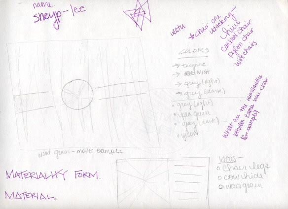
I've been rigorously sketching, trying to get a grasp on what direction I'm headed before I even begin creating the branding materials for this project on the computer. So far, the only computer work I've done has been picking out colors and typefaces. All of these elements are definitely subject to change! I' m definitely not ready to marry an idea yet, however, I definitely know I want to focus on the details of the forms and the forms within the forms as a way of showcases the elements within the furniture that make it unique. 

Colors:


Color wise, I think I want to head in a direction that is both contemporary, but also is a reference to older furniture design. 

Typeface:

Franklin Gothic Roman

Sketches/Ideas:

I'm really unsure about my logo at this stage. I think I really need feedback from some people. I just want to make sure the logo really fits my concept in terms of focusing on the details and forms/shapes of the furniture.


Sunday, February 24, 2013

Project 2: Project Brief

Objective

Create a well-designed and informed identity system, as well as collateral materials and a name for a Des Moines based furniture company selling contemporary and modern designs. The identity system will include a logo, a stationary system, an exterior sign and collateral materials. All of the elements within the identity system must be visually linked and cohesive in order to create a compelling identity system for the furniture store. The identity will showcase the details of the products as well as the formal qualities of the pieces themselves.


Client


This furniture store works both commercially with architects and interior designers, as well as the general public. Their goal, however, is to provide accessibility to modern designs that would typically only be seen in showrooms. The company recognizes that furniture design in America is not taken nearly as seriously by the general public, especially in contrast to Europe. Thus, their goal is to make furniture design something that everyone can have access to.

The designers in which the store showcases designers and materials that span several categories, countries, and eras. The store sells classic designs by Charles Eames, Alvar Aalto, George Nelson, Marcel Breuer, Mies van der Rohe, as well as many others. Contemporary designers include Philipe Starck, Ron Arad, Jorge Pensi, Enrico Franzolini, Rodolfo Dardoni including others. These products generally are exclusively designed for the furniture store.

The client has both a website and a catalog as a way for people to conveniently purchase their products. However, furniture can be bought locally at the store’s location in downtown Des Moines in the East Village, which will open July of 2013. The clothing company intends on expanding by opening stores in New York, Los Angeles, San Francisco, Chicago, Kansas City, Minneapolis and Portland.


Audience


The store is marketed to both design professional and businesses, as well as the general public. The furniture’s intended use is to span both residential as well as commericial and business settings.

Because of the nature of the furniture itself, prices are high and as such, the audience is wealthy and able to afford the luxurious items sold both in-store and online.


Requirements


1. Logo, letterhead, envelope and business card
2. Promotional poster(s) for the store’s opening
3. An exterior sign for the building based upon logo design
4. A small brochure or mailer that describes tpertintent information about the company, all while promoting the store opening


Timeline

2/19/13
Begin researching the furniture and look at its aesthetic as well as formal qualities. Sketch small pictures of the funiture as a means of better understanding the forms. Also, based off of research on the furniture and designers, begin brainstorming name ideas.

2/21/13
Continue research and finalize name.

2/25/13
Begin looking at furniture and start looking for commonalities within the forms of the furniture. Sketch these forms and begin generating possible logos based off of these forms and commonalities. Begin developing a stationary system.

2/28/13
Refine logo and stationary system after critique. Also, begin thinking about the large scale posters and signage.

Friday, February 22, 2013

Project 2: Reading Response

Logos permeate our lives, whether we realize it or not. I think that statement is both accurate and somewhat terrifying. Corporate design has such an influence over culture and society–it’s what we wear, what we choose to eat, drink, etc. It works to meet our everyday needs, but most importantly, it drives us to want and consume. It has become ingrained into to who we are as people and a culture. Because logo design is recognized by everyone (not just designers), it has become something bigger than just simply a design element.

That being said, the nature of a logo design is extremely touche. People become attached to these symbols of consumption and when a logo is changed (even for the better), the world erupts in a frenzy, which only proves that people have become tied to corporate logos. The fact of the matter, however, is that logo design is always changing. In fact, logo design has changed significantly over the last 50 years. Logos now are perhaps less literal and more abstract. However, now today more than ever a logo must work in a variety of different ways. Today’s technology and the pervasiveness of branding has forced designers to think of design in several different mediums to get the message about their brand out into the world. This becomes a challenge. To make a logo work in one place and to work in another is a difficult balancing act, while also trying to stay true to the brand itself.  

As such, a logo is not the only necessary component that must work for a brand. There are several other elements that must be carried along in order to create a successfully working brand. When these elements come together, they form a visual language in which the brand thrives on. This visual language in some aspects, never changes with time. The reading went into detail about several different brand identities, including Coco-Cola, which has remained true to it’s original brand. Utilizing the same Spencerian hand lettering and colors, the brand has maybe only slightly changed as a reaction to the changing culture and time, but has otherwise maintained it’s original identity. Therefore, good branding, in a sense, can be timeless.

Branding can also be anything. From a soft drink to a church, everything in our consumer driven culture has a brand because everything has a message and wants to clearly state that message with a visual language.

Wednesday, February 20, 2013

Project 2: Thoughts & Inspirations

For this project, I first began looking into identity systems, just so I could see how other designers interpreted and translated one common idea and integrating it into various forms and media. I think that's why I find it so fascinating. There is are so many approaches and ways of interpreting something and making it meaningful for each medium. Each medium is distinct, but yet cohesive in terms of the brand.

I went to my favorite web site for design inspiration–Branding Served. Here are a few links to some brands I discovered through my research and found very effective.


PS Art Space

Ten Over Six

Alex Poulsen Architects

AROS

Macbeth PR


I think looking into how these designers approached these brands and how they translated similar ideas for different mediums will be very useful when it is time for me to finally jump into the designing aspect of this project. Unfortunately, I'm still just researching...but I already have some ideas.


Source: http://www.swanklighting.com/files/blog/eames4.jpg


After looking into some images of the furniture that FSX sells and the furniture's history, I've found myself enraptured not only by the forms of the furniture itself, but it's small and minor details. For example, the strangely beautiful triangular shapes that appear in the legs of several Eames' designs. Also, the grain of the wood in their lounge chairs are also quite mesmerizing and luxurious. Thinking about these unique aspects, I think I would like to expose them, showing the form within the form itself. In other words, I think I want to showcase the details.

Something else I thought about exploring was the modernist idea of "form follows function." I think this could be an interesting concept because in the end, it comes down to why we buy furniture–it has a functional purpose! I think it could definitely be a good way to market furniture. This concept, however, will definitely require more thinking, but I think I'm up for the challenge.

Sunday, February 17, 2013

Project 1: It's Done!


The submission page was rather anti-climatic (and grammatically incorrect), but I am indeed finished with project 1! I definitely had my frustrations with this project in it's beginning stages. It was definitely difficult finding a focus and creating something of value and quality. I spent primarily the first two weeks a little lost, researching a wide variety of topics and issues. It also didn't help that the targeted audience for this project was in Europe, so it was definitely unfamiliar territory for me! I didn't know if my thoughts and ideas regarding smart cities would translate or even make sense. It was a huge barrier, but I think in the end I got through it with one poster anyway. I still had the difficult decision of deciding whether to submit the Recycle poster, primarily because I was afraid its concept would not translate over in Italy, where the competition is being held. I decided to take a gamble and just go for it, so I'll have to wait and see whether they are receptive to it.

Regardless, I found this project to be rather challenging (in a good way). I feel accomplished, but now I'm really excited to move onto the next project for Content & Audience. Bring. It. On.

Project 1: The Final Stretch

After Thursday's critique, I have finally found myself in a good place. I was pleased to hear that the majority of the class understood what I was going for conceptually and could see that in my design (hooray). Of course, there were still things to be changed. I needed to increase the leading and alignment in my text. I also had to edit out the birds in the sky, which were causing a lot conflicting messages about my topic. I also needed to create an even greater contrast between the windmill and the smoggy, gray sky. Also, collectively, the class as well as the professor thought I should leave out the equal sign out of my CO2 symbol, as it was starting to get a bit redundant  Luckily, these were all fairly simple changes.

I also decided to mess a little bit with color in the text in an attempt to create more contrast in my composition.

After Thursday's critique, I have also decided to enter my "Recycle" poster into the Posterheroes contest. It's definitely a gamble as I'm not sure if it will translate well for the European audience, but I thought it was still strong regardless.


Conceptually, for this poster I was trying to visually show the benefits of using alternative resources as a way to offset carbon emissions and greenhouse gases. I wanted to show what the sky would look like if we didn't use alternative resources in contrast to what the sky would look like if we did. Essentially, the use of alternatives resources is not only better for our earth, but simply put our cities. Smog is a definite problem in cities, but if wind power is used, city skies have the potential to much cleaner, creating a better living environment for city dwellers. 


This poster revolves around the idea of "re" and how all of these "re's" make our cities cleaner and more environmentally friendly. It is essentially urging city dwellers to consider their own actions. Not only does it encourage them to "recycle" but it also, simply put, encourages them to cycle as well. 


Wednesday, February 13, 2013

Project 1: Poster Description


The driving force behind this poster was the idea of carbon neutrality. Carbon neutrality is defined as the reduction of carbon or greenhouse gas emissions in in order to compensate for or offset an emission made elsewhere. Many European cities have decided to implement this idea of carbon neutrality in order to create a more environmentally friendly city. By using alternative resources and technologies, the carbon neutral initiative not only keeps cities clean but also stimulates the economy. These technologies also help cities save money because from an economic standpoint solar power and wind power are essentially free and those are both ways in which cities can reduce their carbon output.

CO2 emissions are a major cause of air pollution within cities. This poster tackles the issue of city smog by showing how a carbon offset, such as wind energy, can reduce smog within cities, making for a much more pleasant living environment for city dwellers.


The purpose of this poster was to bring about ideas and ways in which city dwellers can contribute to their environment in a positive way. Thinking about the ways in which we can make cities cleaner and more environmentally friendly, ideas of recycling, repurposing, reducing and reusing came to mind. By combining these ideas, smart cities can stay cleaner for its citizens, creating nicer living conditions for their inhabitants.

This poster focuses on two ideas: recycling and reducing. Combining text and imagery, the poster clearly states, “Recycling.” However, the poster tackles more than just recycling. The image of the bike resonates with the idea of reducing gasoline use. Thus, it shows how creating a more environmentally friendly city requires more than just recycling or biking–it requires citizens to do both simultaneously in order keep the environment clean for its inhabitants.

Tuesday, February 12, 2013

Project 1: Progress

I feel like I finally have a grip on this project. I have something fairly solid made up on the computer, but now I'm stuck as to what idea specifically I want to commit to. One poster idea tackles the idea of air pollution from CO2 emissions, while the other sparks ideas of reuse, reduce, repurpose, and recycle. Each poster has their strengths and weaknesses, but pushing past the weaknesses to create and effective and meaningful design has proven to be rather difficult. 

Poster Idea 1


The focus of this poster is air pollution and by using wind power as a means of energy is a good way to prevent further air pollution in cities and push a carbon neutral initiative, which many European cities are attempting to implement. It also tackles issues from an economic standpoint–wind is free! 


Poster Idea 2

While I find this poster to be quite strong, I'm afraid it will not translate in the European world. I also am not sure of whether the ideas of reuse, repurpose, recycle, etc. are even relevant in Europe, making it very difficult for me to even consider submitting this poster to the Posterheroes contest. 

Friday, February 8, 2013

Project 1: Narrowed Focus

After countless sketches, internet searches, and discussions with fellow classmates, I have finally found an idea to work with for the Posterheroes project! After researching various topics and issues within the four categories (economy, living, mobility, and people), I decided to tackle the idea of carbon neutrality. Carbon neutrality aims to cancel out or reduce carbon emissions by replacing harmful energy resources with something "clean" in order to protect our planet and ozone layer. These clean resources are considerably more cost-effective than traditional energy resources, which could save cities money.


Idea 1

Thinking about carbon neutrality, I developed a typographic logo of sorts. It includes the CO2 symbol with an equal sign in the center of the O, which is the symbol for neutrality. Knowing I wanted to incorporate this logo, I decided to think about alternative energy resources, including wind power, which is what I ultimately chose to focus on. Thinking about CO2 emissions and what that does to the air, I decided to cut out a "clean," sky-blue windmill in the midst of a smoggy sky, indicating that by using alternative resources, our skies will be less foggy, grey and more clear and blue.


Playing off the designs below, I continued to push these designs further and further, refining them as I went along, choosing new typefaces and incorporating my own photograph to get the smog effect I desired. 


Idea 2

Because I am not easily satisfied, I decided to work with another idea and concept in regards to carbon neutrality. I wanted to create a recipe of sorts to live life carbon neutral. I will admit, I am struggling with this concept a little more, just because I feel that in order for it be effective, it must be extremely witty! So over the weekend, this will require a lot of thinking and sketching yet, but for now this is what I have. 


Monday, February 4, 2013

Project 1: The Beginning


Posterheroes is a project specially designed for those in the creative field to further conceptualize and promote the idea of “Smart Cities.” The idea of Smart Cities stems from issues regarding energy, healthy living, and pollution, as well as many other problems in which Smart Cities attempt to tackle. There are several major categories that help make up a Smart City. These categories include economy, living, mobility, and people, with each having unique indicators. To the left is a concept map of the indicators for one of these essential categories.

For our first project, we are to creating poster to be submitted to the Posterheroes competition, which is based on the indications of a smart city, and thus promoting a specific indicator or idea. The four major categories for a Smart City are rather broad and the ideas that stem from these categories are also quite broad, so concepts and ideas must be narrowed down further in order to create a compelling poster. In order to grasp this concept of Smart Cities, I did further research to get more specific ideas about its goals and ideals. Furthermore, the competition is based in Europe, which means further research must be done in order to understand the European population in order to gain a firmer understanding of the issues for these cities.

For this particular project, the target audience is a hip, urban-dwelling, youthful demographic, as well as European. To gain a better understanding as to who our audience is, I looked a European design and began doing some research on European cities.

Ultimately, the message for this poster project is call for action. It’s about getting the city dwellers to think critically about their impact on their city as well as their well-being. It’s a very social driven project, calling for change and suggesting ideas on how to live a happier and healthier life within an urban setting.

Design Requirements:
Size
50 X 70 cm at 150 dpi

File Size
Max of 5 MB JPG or PDF

Format Orientation
Vertical layout


Timeline For This Project:


1/29/13
After researching topics and areas of interest, generate 12 thumbnails for each category or topic–economy, living, mobility, and people.

1/31/13
Continue generating ideas and sketches. Do further research if necessary and expand on areas of interest as a way of narrowing down a focus.

2/5/13
Finalize an idea or concept and begin even further researching this topic or issue. Continue doing more sketches in regards to this concept. Create a more refined sketch and if possible, begin computer work.

2/7/13
Begin computer work and start thinking critically in terms of design rather than concept (this will have been done already by now).

2/12/13
Begin preparing posters for a large critique with the class. Poster must be "print" and critique ready, so that there is actually something meaningful there to look at and critique. Think critically about the overall concept and whether its message is resonating through the design.

2/14/13
Using feedback from the large group critique, make any neccessary changes to the poster(s). Submit the poster to the Posterheroes site by Sunday night.


In order to to start thinking about the issues and these Smart City concepts, I began creating concept maps. My ideas stemmed from these maps with each one being based on an issue or category.


 This idea stemmed from the category of smart city living. In my opinion, water waste is a major issue no matter where you live and overpopulated cities in particular must be very conscious about their water use and consumption.

To show the impact of wasteful water use, I drew a water faucet connected to a dried up body of water with dying or dead fish inside. The text reads, "Until the Last Drop" indicating that we will use up our resources if we are not careful about our water consumption.

The next sketch about water consumption is a shower head with water hearts falling from it with the text reading, "Save water; shower together."


//


 The next concept I decided to tackle was the idea of Carbon Neutral.Countries such as Denmark have decided to eliminate CO2 emissions entirely in oder to help protect the ozone layer as well as our planet. For both of these sketches, I did a play off of the equality sign as well as molecular make up of carbon.

 
//


The next concept I decided to focus on was mobility. My interest was definitely about biking or choosing public transport over driving. I played with the idea of wheels and peddling in regards to advancement. I also looked into public transportation and its benefits (including making a friend ;) ). After doing some research, I found out that in Amsterdam, people share cars through this company called WeShare as a means of transportation. In a sense, it is very similar to our idea of carpooling. So I decided to tackle this idea with the slogan Sharing is Caring with a Volkswagon love bug depicted on the poster.


//

Next, I focused on energy and energy consumption, especially in regards to wind power. I had the idea of a flower-like windmill growing from the top of a building and its roots exposed onto the building, indicating that wind power should be the root of the city so to speak. A lot of energy is needed to power a city, so clean energy is the best solution.