Wednesday, March 27, 2013

Project 3: Examples, Brief, etc.


For my project, I think I’m going to tackle a bike route map. When I saw it, I felt a little lost and immediately knew I wanted to change it. For me, the problem lies in the color choices–they’re too similar to the map itself! The bike route lines also don’t stand out from the rest of the map. I found myself constantly searching for clarity in it’s design. I also began to think about how bike riders might grow frustrated with it, especially as they were riding and trying to navigate. After noticing this, I decided I wanted to tackle the bike map route and relate it Iowa’s Bike Month, by combining it with a calendar outlining events and including fun, informational biker facts.


Before I even tackle re-designing this map, I decided to take a look at other map designs. This one, while it is for a subway system, is still a good example. The routes are clear, defined, and well color coded. They also utilize numbers, icons, etc. to get their point across. These are all aspects I hope to bring with my own map design.


Project Brief (Subject to Change)

Objective
Create an informational bike route map/pamphlet/calendar promoting biking in the Des Moines area and the Des Moines Bike Collective’s annual bike month. Through this project I will develop a more coded and less confusing bike route map than the Des Moines Bike Collective’s current map. While there is a very informational map included, I will also design a calendar for the month of May, which is Iowa’s Bike Month, which will outline every Bike related area event. This map/calendar will also include pertinent bike and bike safety information for area bike riders.

The overall design and concept will be fresh, progressive and new. I hope to keep the map aspect of it small so that it could easily be brought along on bike rides.

Client
The client for this project will be the Des Moines Bike Collective.

Audience
The audience will be Des Moines area bikers, both new and old.

Requirements
There are no requirements for this project at this point.

Timeline

3/28
Narrow a focus and begin sketching ideas and ways in which the bike route map could be more efficient and clear.

4/2
Continue working on the bike route map so that is more clear. Begin transferring ideas onto the computer.

4/4
Begin the calendar aspect of the design and continue refining the map.

Tuesday, March 26, 2013

Project 3: Reading Responses


The Information Design Handbook Reading Response:

While I was already familiar to semiotics thanks to my design theory class, it was still useful to learn more about them using different terminology than what was used in my design theory class. The reading approached it in a more simplistic approach, which I found helpful, especially when I consider the signs I want to use in my project.

The study of signs, or rather semiotics, is useful for graphic designers as it informs our ability to interpret images or other sensory input. Knowing semiotics and our audience helps designers better choose the right signs to use in their work. When looking at both semiotics and our audience, we must think about context, culture, and personal experience, which all influence a sign’s connotative and denotative attributes. Signs can be broken down into three different categories: icons, indexes, and symbols.

Icons factually resembles a concept or idea. Rather, it is a literal visual representation of a concept or idea. An example of an icon would be a red heart, which allows the viewer to think about love or affection, or even perhaps think about health. Icons help the viewer derive meaning.

Indexes are representations that are perhaps more distant but still create a connection. The relationship between the sign and what it stands for is perhaps more obscure. It is also descriptive. An example of an index would include smoke which indicates fire.

Symbols are abstract representations. These signs are learned over time within a specific time and culture. An example of a symbol would be the recycle sign.


The reading also touched on multiple theories that could be utilized when designing something informational. While I found all of them to be useful, I really found the LATCH model to be the most pertinent to this next project for Content & Audience. It outlines a basic guideline for organizing information in such a way that is best for the user. The LATCH model stands for Location, Alphabet, Time, Category, and Hierarchy. All of these are ways in which a designer could group information content in such a way that makes sense to the user.

I gained a lot of useful tips from this reading and there are definitely several I intend to implement in my project. The first “quick tip” I would consider is providing a map, as it is the most efficient and easiest method of wayfinding for users. Users don’t ever want to feel lost and a map can be comforting as it is a way for them to orient themselves. I will definitely include a map in this next project because of this.

The next “quick tip” I would like to implement in my work is “don’t decorate, design.” This is always relevant no matter what you are designing, but it is especially important for informational design. Everything in informational design is crucial for the user and the user will look at is as informational, so if it has no purpose it is not relevant to the design. As such, I am hoping to keep my designs clean and concise, but deliberate.

The final “quick tip” is “don’t reinvent the wheel.” In other words, I am not going to make up my own symbols! This will only confuse the user and leave them extremely frustrated. As such, I will need to grow accustom to typical signs and icons that relate to my informational design.


The Laws of Simplicity Reading Response:

This reading outlines the ways in which you can avoid cluttered design, especially if you are working with a lot of information. Essentially, breaks down these ways through the use of the acronym, SLIP, which is a systematic step-by-step approach. SLIP stands for SORT, LABEL, INTEGRATE, and PRIORITIZE. Sort essentially means to sort out the information obtained into groupings. Next, label each grouping. The next step is to integrate, which means that when possible, create broader, overarching categories or groupings and combine some of the groups first made. The last step is to prioritize, which essentially means ranking information or groupings from greatest level of importance to the lowest level of importance in order to create hierarchy. This step-by-step process will be very useful as I obtain more and more information for this project.

“Squint at the world. You will see more by seeing less.” This quote really resonated with me. It’s a very simplistic tip, but one that can be incredibly useful when trying to organize information, all while maintaining a level of good design.

Thursday, March 14, 2013

Project 2: It's Done.

Below are the final versions of my branding project, Sheyp-lee.


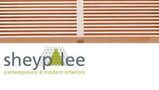
For my branding project I really wanted to focus on materiality and form of the furniture. For me, it was all about the details and portraying some of those details to the audience through the brand by displaying textures, patterns, and forms. What separates this particular style of furniture from any other are the unique details, which is why I chose to highlight this aspect. I cropped images of wood grain and other textures and used them throughout my identity system. I also created my own texture that I used in my logo and throughout, which was inspired by the metal tulip shaped legs on many of the Charles Eames chairs.

I wanted to create a brand that was somewhat playful. Modern and contemporary furniture store branding can sometimes come off as very serious and in some ways a little intimidating, so I wanted to change that up a little bit. Considering the client is a company that wants to make design accessible to all, I wanted to create a design that would be less intimidating to those who aren’t necessarily in the design industry but also relevant to people who are familiar with it. By using a bright green and a lowercase sans-serif typeface, it was already starting to feel more fun so to speak. My layouts were also very very airy and less structured, which was purposeful.

Project 2: Final Project Brief


Objective

Create a well-designed and informed identity system, as well as collateral materials and a name for a Des Moines based furniture company selling contemporary and modern designs. The identity system will include a logo, a stationary system, an exterior sign and collateral materials. All of the elements within the identity system must be visually linked and cohesive in order to create a compelling identity system for the furniture store. The identity will showcase the details of the products as well as the formal qualities of the pieces themselves.


Client


This furniture store works both commercially with architects and interior designers, as well as the general public. Their goal, however, is to provide accessibility to modern designs that would typically only be seen in showrooms. The company recognizes that furniture design in America is not taken nearly as seriously by the general public, especially in contrast to Europe. Thus, their goal is to make furniture design something that everyone can have access to.

The designers in which the store showcases designers and materials that span several categories, countries, and eras. The store sells classic designs by Charles Eames, Alvar Aalto, George Nelson, Marcel Breuer, Mies van der Rohe, as well as many others. Contemporary designers include Philipe Starck, Ron Arad, Jorge Pensi, Enrico Franzolini, Rodolfo Dardoni including others. These products generally are exclusively designed for the furniture store.

The client has both a website and a catalog as a way for people to conveniently purchase their products. However, furniture can be bought locally at the store’s location in downtown Des Moines in the East Village, which will open July of 2013. The clothing company intends on expanding by opening stores in New York, Los Angeles, San Francisco, Chicago, Kansas City, Minneapolis and Portland.


Audience


The store is marketed to both design professional and businesses, as well as the general public. The furniture’s intended use is to span both residential as well as commericial and business settings.

Because of the nature of the furniture itself, prices are high and as such, the audience is wealthy and able to afford the luxurious items sold both in-store and online.


Requirements


1. Logo, letterhead, envelope and business card
2. Promotional poster(s) for the store’s opening
3. An exterior sign for the building based upon logo design
4. A small brochure or mailer that describes tpertintent information about the company, all while promoting the store opening


Timeline

2/19/13
Begin researching the furniture and look at its aesthetic as well as formal qualities. Sketch small pictures of the funiture as a means of better understanding the forms. Also, based off of research on the furniture and designers, begin brainstorming name ideas.

2/21/13
Continue research and finalize name.

2/25/13
Begin looking at furniture and start looking for commonalities within the forms of the furniture. Sketch these forms and begin generating possible logos based off of these forms and commonalities. Begin developing a stationary system.

2/28/13
Refine logo and stationary system after critique. Also, begin thinking about the large scale posters and signage.

3/4/13
Continue refinining materials and begin designing posters as well as the mailer. Continue looking for continuity in these items and see how they relate to the stationary set.

3/7/13
Taking feedback from in class peer critique, make any necessary changes. Push forward on the poster and mailer and begin thinking about how these items will look printed out. Once a plan for printing as been determined, begin printing these items and prepare them for critique.

3/11/13
Based on feedback from critique, begin making any necessary changes and prepare items to be completed for Thursday March 14th.


Saturday, March 9, 2013

Project 2: Developments

I think these are the designs I'm fairly set on for Tuesday's critique. Hopefully I'll get useful feedback and can make my designs even better!

Letterheads


Business cards


Mailer


Poster Variations


Envelope 


Sunday, March 3, 2013

Project 2: In Progress...


Below are some images of potential logos for my furniture store brand, Sheyp-lee. Focusing on the forms and shapes within the furniture, I thought the name Sheyp-lee was a good name for my store. Thinking about both the name and my concept, I decided I wanted a more graphic logo instead of a typographic one. As of right now, I am currently leaning towards the triangle logo and all of the variations I have created. I'm not 100% set on one quite yet, but I think they could all work with my concept. 


For my letterhead, I was trying to figure out the best ways in which I could incorporate my logo. Some of my ideas were very rough (and in fact ugly), but  I think I'm starting to get somewhere. Since I have a direction with my letterhead and logo, I've decided to start thinking about my mailer and poster. I already have some ideas and hopefully they will work out. So far, this is essentially what I have as a cover for the mailer. I really want to expand on these ideas and make them better and more refined. Hopefully I can do that!

This was one of the first designs I came up with for my letterhead. Since I've expanded on this format to include actual photographs. I've also tried to link my letterhead to my business cards and envelopes. 


(Front)

(Front)

(Back)


Next, I started to think about how I wanted to my mailer and poster to look like. I think this is the direction I'm headed in. Again, it definitely needs some refinement, but it's an idea and a start.