Showing posts with label project2. Show all posts

Saturday, March 9, 2013

Project 2: Developments

I think these are the designs I'm fairly set on for Tuesday's critique. Hopefully I'll get useful feedback and can make my designs even better!

Letterheads


Business cards


Mailer


Poster Variations


Envelope 


Sunday, March 3, 2013

Project 2: In Progress...


Below are some images of potential logos for my furniture store brand, Sheyp-lee. Focusing on the forms and shapes within the furniture, I thought the name Sheyp-lee was a good name for my store. Thinking about both the name and my concept, I decided I wanted a more graphic logo instead of a typographic one. As of right now, I am currently leaning towards the triangle logo and all of the variations I have created. I'm not 100% set on one quite yet, but I think they could all work with my concept. 


For my letterhead, I was trying to figure out the best ways in which I could incorporate my logo. Some of my ideas were very rough (and in fact ugly), but  I think I'm starting to get somewhere. Since I have a direction with my letterhead and logo, I've decided to start thinking about my mailer and poster. I already have some ideas and hopefully they will work out. So far, this is essentially what I have as a cover for the mailer. I really want to expand on these ideas and make them better and more refined. Hopefully I can do that!

This was one of the first designs I came up with for my letterhead. Since I've expanded on this format to include actual photographs. I've also tried to link my letterhead to my business cards and envelopes. 


(Front)

(Front)

(Back)


Next, I started to think about how I wanted to my mailer and poster to look like. I think this is the direction I'm headed in. Again, it definitely needs some refinement, but it's an idea and a start. 


Monday, February 25, 2013

Project 2: Sketches & Ideas

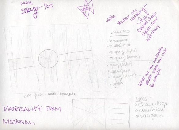
I've been rigorously sketching, trying to get a grasp on what direction I'm headed before I even begin creating the branding materials for this project on the computer. So far, the only computer work I've done has been picking out colors and typefaces. All of these elements are definitely subject to change! I' m definitely not ready to marry an idea yet, however, I definitely know I want to focus on the details of the forms and the forms within the forms as a way of showcases the elements within the furniture that make it unique. 

Colors:


Color wise, I think I want to head in a direction that is both contemporary, but also is a reference to older furniture design. 

Typeface:

Franklin Gothic Roman

Sketches/Ideas:

I'm really unsure about my logo at this stage. I think I really need feedback from some people. I just want to make sure the logo really fits my concept in terms of focusing on the details and forms/shapes of the furniture.


Sunday, February 24, 2013

Project 2: Project Brief

Objective

Create a well-designed and informed identity system, as well as collateral materials and a name for a Des Moines based furniture company selling contemporary and modern designs. The identity system will include a logo, a stationary system, an exterior sign and collateral materials. All of the elements within the identity system must be visually linked and cohesive in order to create a compelling identity system for the furniture store. The identity will showcase the details of the products as well as the formal qualities of the pieces themselves.


Client


This furniture store works both commercially with architects and interior designers, as well as the general public. Their goal, however, is to provide accessibility to modern designs that would typically only be seen in showrooms. The company recognizes that furniture design in America is not taken nearly as seriously by the general public, especially in contrast to Europe. Thus, their goal is to make furniture design something that everyone can have access to.

The designers in which the store showcases designers and materials that span several categories, countries, and eras. The store sells classic designs by Charles Eames, Alvar Aalto, George Nelson, Marcel Breuer, Mies van der Rohe, as well as many others. Contemporary designers include Philipe Starck, Ron Arad, Jorge Pensi, Enrico Franzolini, Rodolfo Dardoni including others. These products generally are exclusively designed for the furniture store.

The client has both a website and a catalog as a way for people to conveniently purchase their products. However, furniture can be bought locally at the store’s location in downtown Des Moines in the East Village, which will open July of 2013. The clothing company intends on expanding by opening stores in New York, Los Angeles, San Francisco, Chicago, Kansas City, Minneapolis and Portland.


Audience


The store is marketed to both design professional and businesses, as well as the general public. The furniture’s intended use is to span both residential as well as commericial and business settings.

Because of the nature of the furniture itself, prices are high and as such, the audience is wealthy and able to afford the luxurious items sold both in-store and online.


Requirements


1. Logo, letterhead, envelope and business card
2. Promotional poster(s) for the store’s opening
3. An exterior sign for the building based upon logo design
4. A small brochure or mailer that describes tpertintent information about the company, all while promoting the store opening


Timeline

2/19/13
Begin researching the furniture and look at its aesthetic as well as formal qualities. Sketch small pictures of the funiture as a means of better understanding the forms. Also, based off of research on the furniture and designers, begin brainstorming name ideas.

2/21/13
Continue research and finalize name.

2/25/13
Begin looking at furniture and start looking for commonalities within the forms of the furniture. Sketch these forms and begin generating possible logos based off of these forms and commonalities. Begin developing a stationary system.

2/28/13
Refine logo and stationary system after critique. Also, begin thinking about the large scale posters and signage.

Friday, February 22, 2013

Project 2: Reading Response

Logos permeate our lives, whether we realize it or not. I think that statement is both accurate and somewhat terrifying. Corporate design has such an influence over culture and society–it’s what we wear, what we choose to eat, drink, etc. It works to meet our everyday needs, but most importantly, it drives us to want and consume. It has become ingrained into to who we are as people and a culture. Because logo design is recognized by everyone (not just designers), it has become something bigger than just simply a design element.

That being said, the nature of a logo design is extremely touche. People become attached to these symbols of consumption and when a logo is changed (even for the better), the world erupts in a frenzy, which only proves that people have become tied to corporate logos. The fact of the matter, however, is that logo design is always changing. In fact, logo design has changed significantly over the last 50 years. Logos now are perhaps less literal and more abstract. However, now today more than ever a logo must work in a variety of different ways. Today’s technology and the pervasiveness of branding has forced designers to think of design in several different mediums to get the message about their brand out into the world. This becomes a challenge. To make a logo work in one place and to work in another is a difficult balancing act, while also trying to stay true to the brand itself.  

As such, a logo is not the only necessary component that must work for a brand. There are several other elements that must be carried along in order to create a successfully working brand. When these elements come together, they form a visual language in which the brand thrives on. This visual language in some aspects, never changes with time. The reading went into detail about several different brand identities, including Coco-Cola, which has remained true to it’s original brand. Utilizing the same Spencerian hand lettering and colors, the brand has maybe only slightly changed as a reaction to the changing culture and time, but has otherwise maintained it’s original identity. Therefore, good branding, in a sense, can be timeless.

Branding can also be anything. From a soft drink to a church, everything in our consumer driven culture has a brand because everything has a message and wants to clearly state that message with a visual language.
Wednesday, February 20, 2013

Project 2: Thoughts & Inspirations

For this project, I first began looking into identity systems, just so I could see how other designers interpreted and translated one common idea and integrating it into various forms and media. I think that's why I find it so fascinating. There is are so many approaches and ways of interpreting something and making it meaningful for each medium. Each medium is distinct, but yet cohesive in terms of the brand.

I went to my favorite web site for design inspiration–Branding Served. Here are a few links to some brands I discovered through my research and found very effective.


PS Art Space

Ten Over Six

Alex Poulsen Architects

AROS

Macbeth PR


I think looking into how these designers approached these brands and how they translated similar ideas for different mediums will be very useful when it is time for me to finally jump into the designing aspect of this project. Unfortunately, I'm still just researching...but I already have some ideas.


Source: http://www.swanklighting.com/files/blog/eames4.jpg


After looking into some images of the furniture that FSX sells and the furniture's history, I've found myself enraptured not only by the forms of the furniture itself, but it's small and minor details. For example, the strangely beautiful triangular shapes that appear in the legs of several Eames' designs. Also, the grain of the wood in their lounge chairs are also quite mesmerizing and luxurious. Thinking about these unique aspects, I think I would like to expose them, showing the form within the form itself. In other words, I think I want to showcase the details.

Something else I thought about exploring was the modernist idea of "form follows function." I think this could be an interesting concept because in the end, it comes down to why we buy furniture–it has a functional purpose! I think it could definitely be a good way to market furniture. This concept, however, will definitely require more thinking, but I think I'm up for the challenge.
